
Components
Components are the building blocks of Cards, there are 20 different components found in the component library. Components are selected within the component library and drag and dropped into the edit panel. Once a component is in the edit panel, it can then be customised by interacting with the properties section.
The Card Designer interface
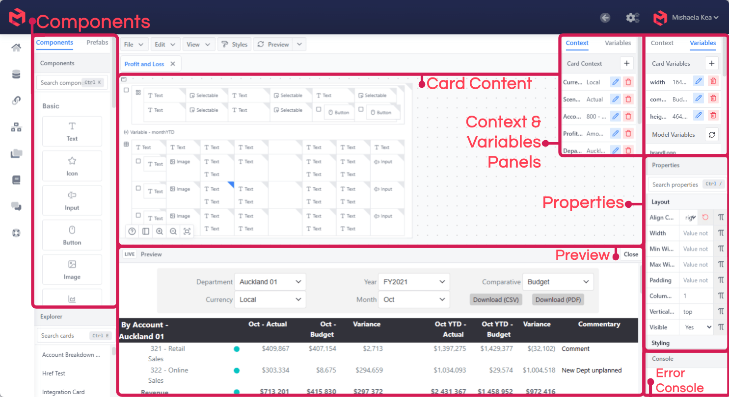
Fig. 1. Card Designer Interface
| Panel | Purpose |
|---|---|
| Components | The component library, plus Prefabs. Search with Ctrl K. |
| Card Content | The editing canvas, where components are arranged. |
| Context & Variables | The dimension/element context the card renders against, and its variables. |
| Properties | Properties of the currently selected component. |
| Preview | The card as an end user sees it. |
| Error Console | Errors raised while rendering. |
Adding a component
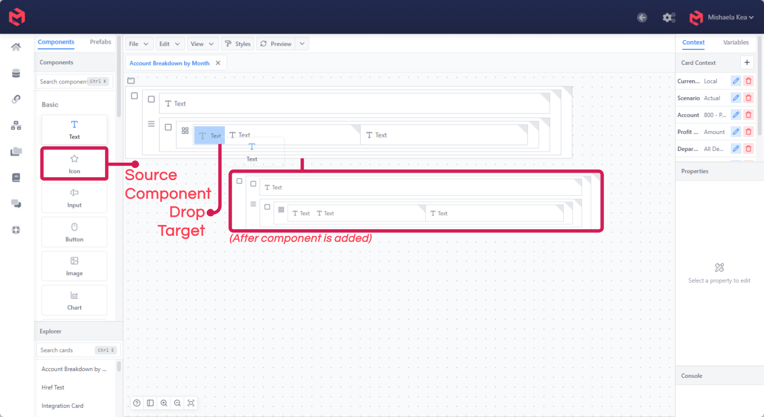
Components are dragged from the library onto the canvas. The drop target is highlighted as you drag, and the component is inserted where you release it.
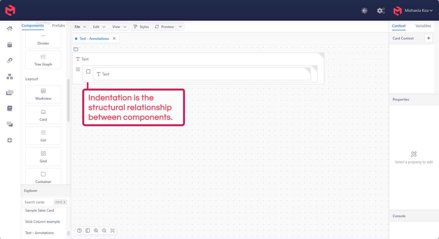
Indentation on the canvas is the structural relationship between components - a component indented under another is nested inside it.
Component Properties
Every Component has a range of properties that can be edited and adjusted to suit the desired function and look of your card. The properties are accessible in the Selected Component Properties Panel (the Properties panel of Fig. 1 above).
Properties are grouped - Other, Styling, Interactivity, Layout - and editable either by typing directly in the corresponding input box or by clicking the formula icon on the right to enter a formula.
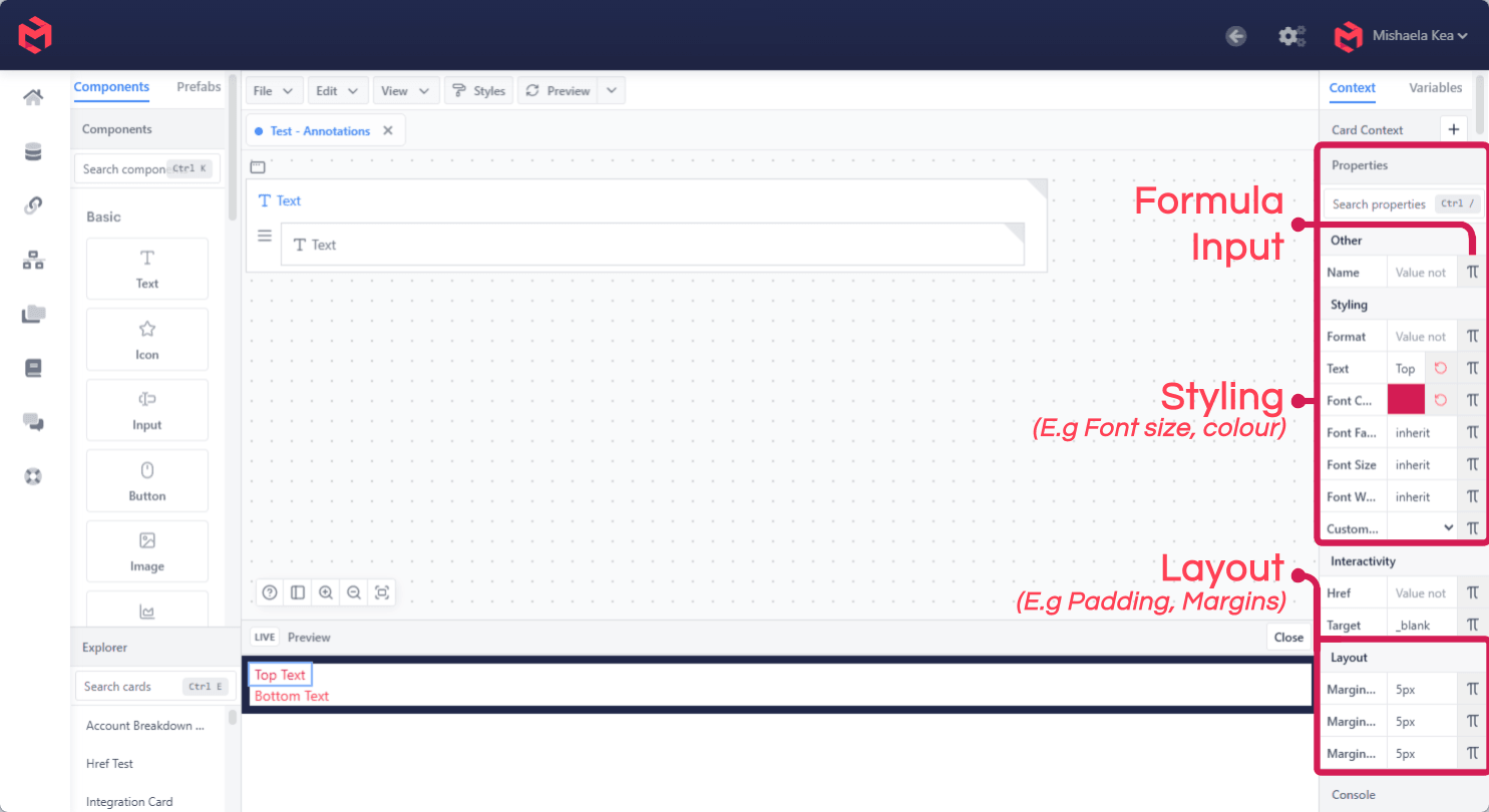
When a property is changed, there are two ways this will be shown- in the card preview itself (you may have to click the ‘Preview’ button to refresh these changes), and in the Selected Component Properties panel. The changed property in the Selected Components Property panel will either:
Contain the change visibly in the corresponding property’s input box Have the input box grayed and unable to be typed into (this indicates that the property has been changed using a formula - it is editable again by clicking the small calculator icon)
Driving a property with a formula
Clicking a property's formula icon opens the Apply Formula editor. The formula is evaluated when the card renders, so a property can respond to the card's context rather than being fixed.
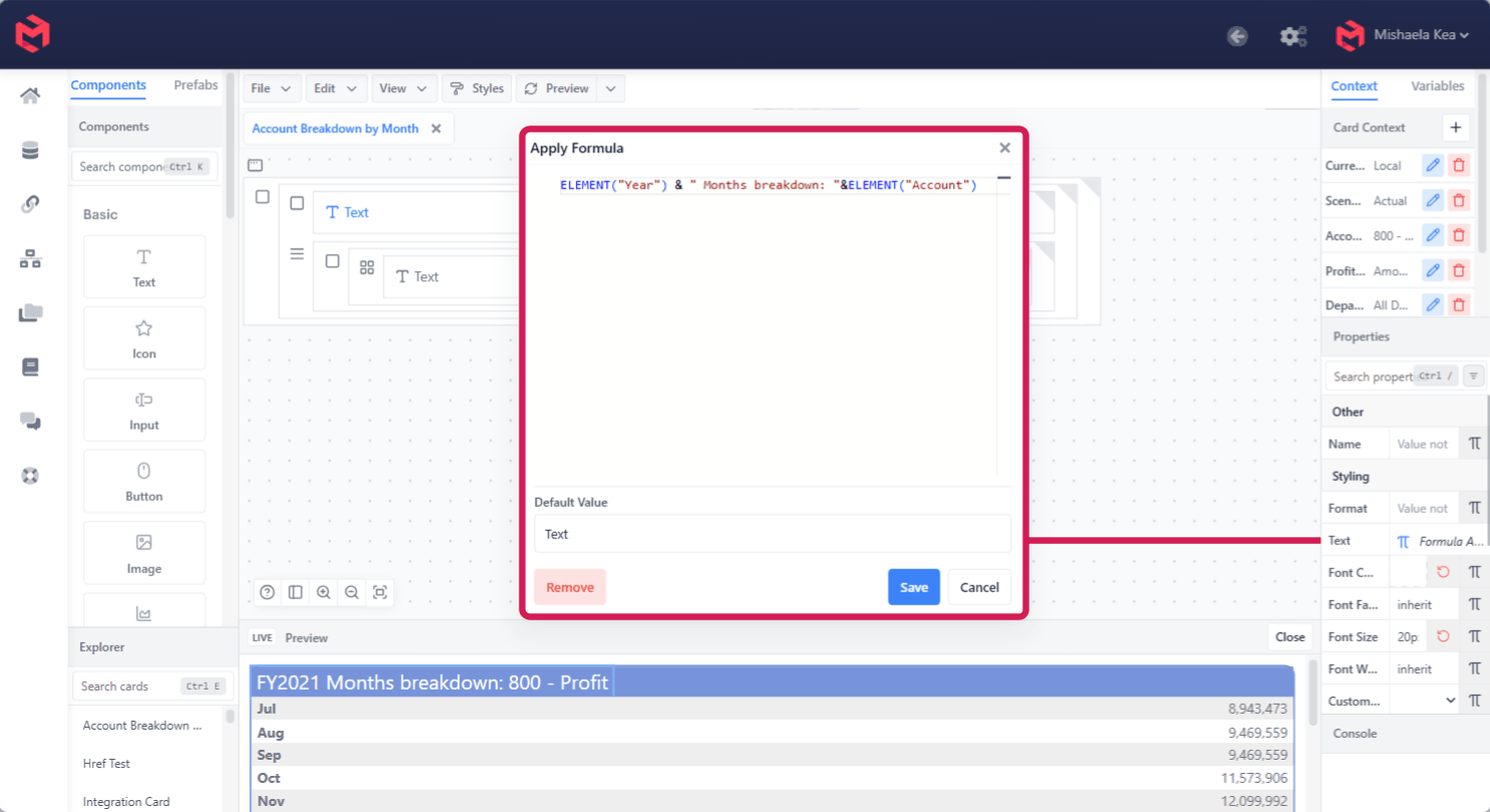
Formulas concatenate with &, and ELEMENT reads the current context - so a heading can name what it's showing:
ELEMENT("Year") & " Months breakdown: " & ELEMENT("Account")renders as FY2021 Months breakdown: 800 - Profit, and changes automatically when the card's context changes.
Default Value is what the property falls back to if the formula can't resolve, and Remove clears the formula and returns the property to direct entry.
Generic Properties
While all components have some unique properties, there are also generic properties shared universally among most components.
Name
The name field is used with some components to help identify it on the card designer.
Align Content
Align content allows you to align the elements inside the component to the right, left or center of the component’s bounds.
Margins
Margins are used to adjust the position and/or spacing of a component, measured in pixels. For example, if you would like to move a component downwards, you would give it a higher value on Margin Top. You can also use negative values.
Padding
Padding is the internal spacing of a component. Below is a visual distinction between padding and margin, with the component being the blue block in the image.
Custom Style
Custom Style lets you attach a reusable, CSS-based style (built in the Style Editor, and shared across every card in the model) to a component. It's an advanced feature intended for styling beyond what the standard properties above cover.